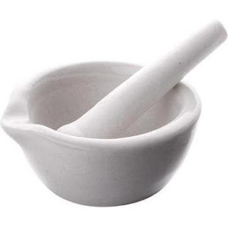
A big drug store chain is changing its logo, and the new look includes a mortar and pestle. That one was a head scratcher. For years, a mortar and pestle was part of the apothecary business, but that was a long time ago. Unless you grind your own spices, no one under the age of thirty knows what this thing is. Maybe the chain is going for a "traditional quality and service" image. I just don't know. I do know many stores in the chain have been modernized and the look is rather nice. Contemporary. Bright. Easy to maneuver. Informative signs. A mortar and pestle seems to go against that image.
Speaking of archaic, regular blog readers know that I use a fair share of graphics here, and I create many of them myself. They're not great. They're not awful, either. I am very fond of the "typewriter" style font, but I phased it out. Same reason I'm anti mortar and pestle. No one under the age of 30 gets it.
I assume the drug store marketing people tested the new logo, at least I hope they did. I also assume it received a passing grade.
No one asked me.


