But, I like it when the Milwaukee brewers wear their 70's uniforms with what was called the dog paw logo. It's actually an M and B positioned to form a baseball glove. The current uniforms are sharp. however, a little nostalgia never hurts.
The same goes for the San Diego Padres. the team switched to a blue and yellow color scheme several years ago. Once in a while, they pull out the old brown and gold, and I really like it. It's refreshing. Outside of Some Mariners teal, and Oakland green, most of baseball is red, white and blue.
A something different is never a bad thing.
 Some teams have gone back to pale blue for road uniforms, like the Phillies once had. I like that, too. It's a break from the sea of grey.
I also miss the Pirates 1876 cap, the one that celebrated the league's centennial. A lot of teams wore them. the Pirates were the last to go traditional again.
Some things should never change-- like the brilliant white of the Dodgers and Orioles home uniforms.
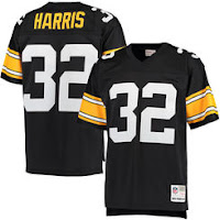
 And, one last thing. It deals with football. I really wish the Steelers would dump the rounded uniform numbers and go back to the blocky, square style. The team looked much more menacing.

